2020 proved to be a pivotal year for many businesses. Some have successfully rid this online wave out. The others have sunk into oblivion without a single idea of the opportunities that self-isolation gave us. But the best part about that is the following: shopping online is happening much more often now, which means that the visual aspect of your site must help your business promotion even more than ever.
Explore the latest web design and website design trends of 2021 and stay on top of the business wave with our UX-UI designer Anastasia Surta.
Top5 Dos
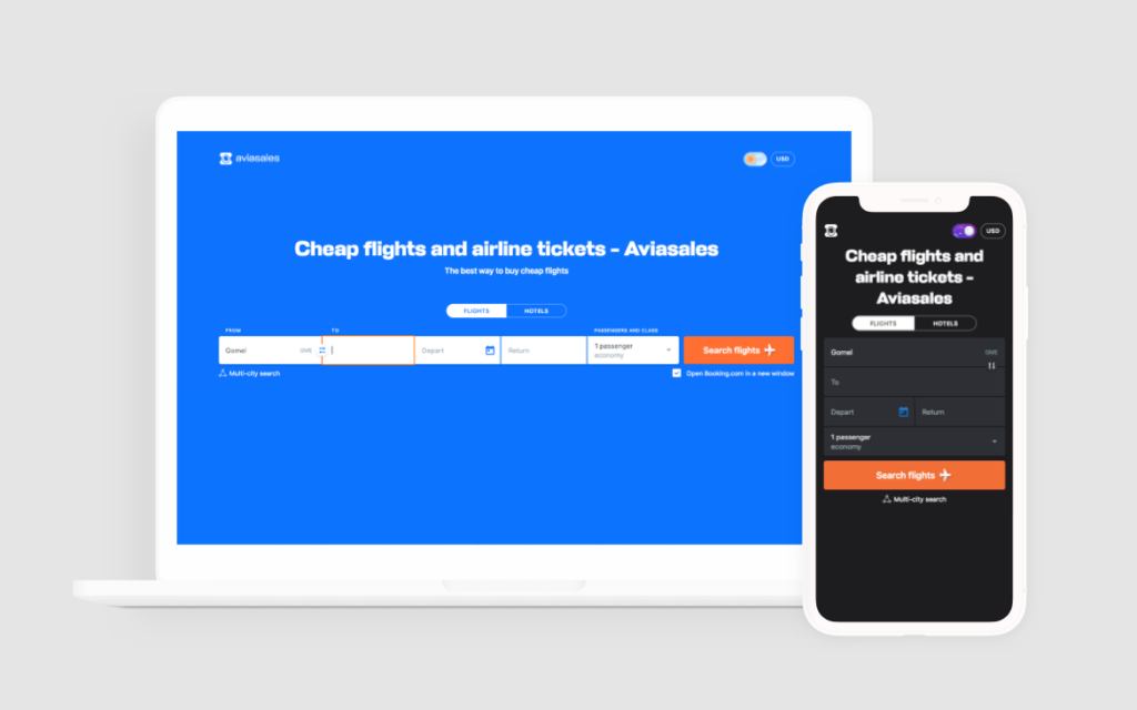
Web design trend 1. Your favorite social network style
Have you noticed that most websites, no matter what they sell, have become more and more alike the most popular social networks globally?
Does that ring any bells? It reminds the home page of any Instagram or Facebook account, doesn’t it? Especially when watching it on mobile.
Relevant domains: beauty, fashion, online academies, etc.
Why it works: The design solution is quite apparent. Products of these categories have been sold on Instagram for years, so why not make a website similar to your favorite social network page, where you can study trends, browse your feed. Its interface is easy to use even for newcomers, cause they’ve already seen all this ‘somewhere else’ and know what to do.
Web design trend 2. Minimalism is new black
People are tired of complexity and unnecessary information. It’s not just about one picture on the homepage. Here, the designer’s task is to display the product’s many gifts with the help of a few simple, understandable forms without getting sidetracked by decorative elements.
The lovely and simple way to use the best of minimalism was found by Google pretty long ago.
It might sometimes seem that minimalism is simple – just clean up a lot of stuff and see what’s left behind. It doesn’t work that way, though. The true minimalism is in the details. And firstly you need to pay attention to:
arrow_forwardAll-round easiness
Clear and clean lines. No unnecessary details, complex fonts and a variety of diverse illustrations, complex grid to place information and media. This approach may also help you optimize your site content: from minimalistic photos to relevant videos and text design.
arrow_forwardPure colors
We have already mentioned that modern designers prefer black&white color themes, or at least the pastel ones, and do not use those loud colors.
But 2021 sets its own rules, and we have nothing but to adjust. The most important thing about using any color is providing good contrast between images and the background. That’s why the white experience is still relevant. For example, it can be mixed up with some bright semantic accents, where the eyes should go first.
arrow_forwardSpace
In this case, it’s Mies van der Rohe’s Less is More. The designer strips all the unnecessary stuff off and leaves only the main thing. Proper spacing allows you to draw attention to the critical spots on the site. The user does not have to digest information for too long. They get just what he’s come for. As if suspended in the sky, photo/graphics/text in the website space help the prospect not to get lost in the information stream, providing the opportunity to engage with confidence in open and authentic B2C/B2B communication.
Web design trend 3. Come over to the dark side
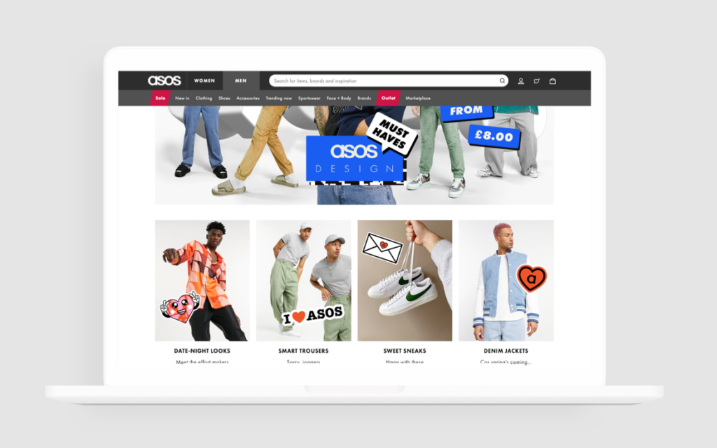
Well, interestingly, not only have social networks begun offering a walk on the ‘dark side,’ but many websites now are also eager to help you save your mobile device battery charge. And this is not just a new trend. For a long time, such giants as Apple, Mercedes-Benz, Instagram, Telegram, WhatsApp, ASOS have been trying to look exciting and delight the eyes of their consumers, both literally and figuratively.
It is essential to mention that companies also choose to adopt in this case. When users browse the phone, they can select the dark theme on the site or in the application. Not all websites have such a function in desktop versions, though. For example, the ASOS website on your PC will have a standard white background and pictures, but on the mobile device and in the application, you can choose ‘the dark side.’
What’s the point: First, it’s better for your eyes. Plus, the dark theme is convenient to use in poor light or dark. Secondly, many graphic solutions can be more attractive against the dark background. Thirdly, it increases the contrast ratio.
And dark themes are great for OLED screens (not only TVs but also Samsung smartphones), as they save energy and increase the screen’s lifespan. Dark shades let you produce creative elements with a neon glow, one of the graphic design trends in 2021.
Web design trend 4. New level of reality
Mixing realism and illustrations, 3D computer graphics present another trend in web design that you could have caught yet in the outgoing 2020. Well, now you just have no choice but to like it. Such an approach is a tribute to pop art lovers. It creates a playful mood, as well as specific layering. Using this technique will show that your company is keeping up with the times and does say a great deal about your product and target audience.
Web design trend 5. New level of interactivity
Artificial intelligence in all its forms (chatbots, neural networks, etc.), asymmetrical, puzzle-like layouts, fluid animation – it doesn’t matter how, but it’s time to move to the next level of communication with a prospect who can get bored at any moment.
For example, on the DePlace Maison website, your mouse has a form of black blob – the kind of game you can’t help but play. That means your visit to the site will be longer than you expected. And this is a guarantee that you will study the site and its products without even knowing it.
Top5 Don’ts
Once we’ve sorted out the Must-Know part, let’s quickly skip to the top5 don’ts you’d better avoid this year (and many years to come):
1. Use many different fonts, both in size and style
Why does the user need the text on your site? In order to read it, learn about you, your product, or your service. But there is a big ‘BUT’ – small print or complex font style.
Today people keep their attention for no longer than 8 seconds – this time is enough to read 18 words. If your text is more extensive, with small print, the user will likely scroll down the page. Different font styles put together may also distract and even annoy the user.
What to do: Use video or animation + voice to bring your product to life. And find a consultant offering UX design services if you haven’t done that yet.
2. Use sliders
Have you ever tried to open the Zara website from the phone? That means you know our pain. Sliders make the site heavier than it should be and look a bit old and dusty.
Technical Director and a web developer for Marketing Communications at the University of Notre Dame Erik Runyon tracked clicks on ND.edu’s slider from mid-October to January 22. During that period, ND.edu’s home page was viewed about 2.9 million times, and slides were clicked only 28,928 times, resulting in a clickthrough rate of about 1%. At the same time, 84% of clicks occurred only on the first slide. The reason is that sliders look similar to banner advertising usually placed on the side of the site, so no one pays attention to it.
3. Low contrast fonts
We hope no one does this anymore, but if you feel this is about you, reach the user experience design agency and ask them to correct the mistake.
The editor of an Australian magazine, Colin Wheeldon, decided to ask his readers what color of background and text they considered acceptable. Guess what he discovered:
- Black text on white: 70% good, 19% fair, 11% poor;
- White text on black: 0% good, 12% fair, 88% bad;
- White text on purple: 2% good, 16% fair, 82% bad;
- White text on royal blue: 0% good, 4% fair, 96% bad.
4. No accent color for calls to action
Asking someone to “Buy Now” or “Start a Free Trial,” you gotta be sure that the button you want people to click is attractive enough for such a giant step.
Savvy Internet marketers know that you need a good accent color to draw attention to critical calls to action. If you’re asking someone to “Buy Now” or “Start a Free Trial,” you want to make sure you use a button color that will draw people’s attention so they’ll click and take the action you want them to take.
It sounds simple, but it may become a pretty tricky and challenging task. Here are some basic rules for accent colors to follow:
- It needs to be bright enough.
- It needs to complement the other colors on your website.
- It needs to stand out from whatever background it’s on.
- It needs to be reserved for key calls to action so not to get overused on the site.
5. Common design principle breakdown
And the worst thing you can’t afford in 2021 is making your website visitors think hard to take simple steps. For example, they’ve already known where to find logos and taglines (in the top left of a page), menus (in the top right), About or Contact pages, etc. Not a good time for surprises, right?
Great start, but I’m afraid it’s time to wrap up. We wish you luck in whatever comes next to make your website design work for you in 2021. And remember, you have your PieSoft user experience design team to help you walk this long and winding road.