Web technologies are moving really fast. And yesterday’s second to none solution may turn into a pumpkin in no time. Together with PieSoft, let’s have a quick check out if your business website’s up to date with the latest design trends. So, it’s time to raise the alarms, if your website is…
Mistake 1. Business website is making a misleading first impression
How long does it take to make a first (and usually the last) impression? Bet you’d never believe, but half a blink! Or 0.05 seconds in numbers.
This time is enough for your website visitor to understand where they are and whether they like it or not. And you’d better make it worth their while. Or at least make your business website design clear and comprehensible, and not annoying. You know, less is more, as they say.
The user should immediately discover their whereabouts and where to click in order to view your portfolio, read an article, place an order, etc.
Interface, colors, graphics and fonts are important here – all of them help you highlight significant points.
Here is an example of how it works. This is a website admin area before… and after it came into the hands of PieSoft UX designer.
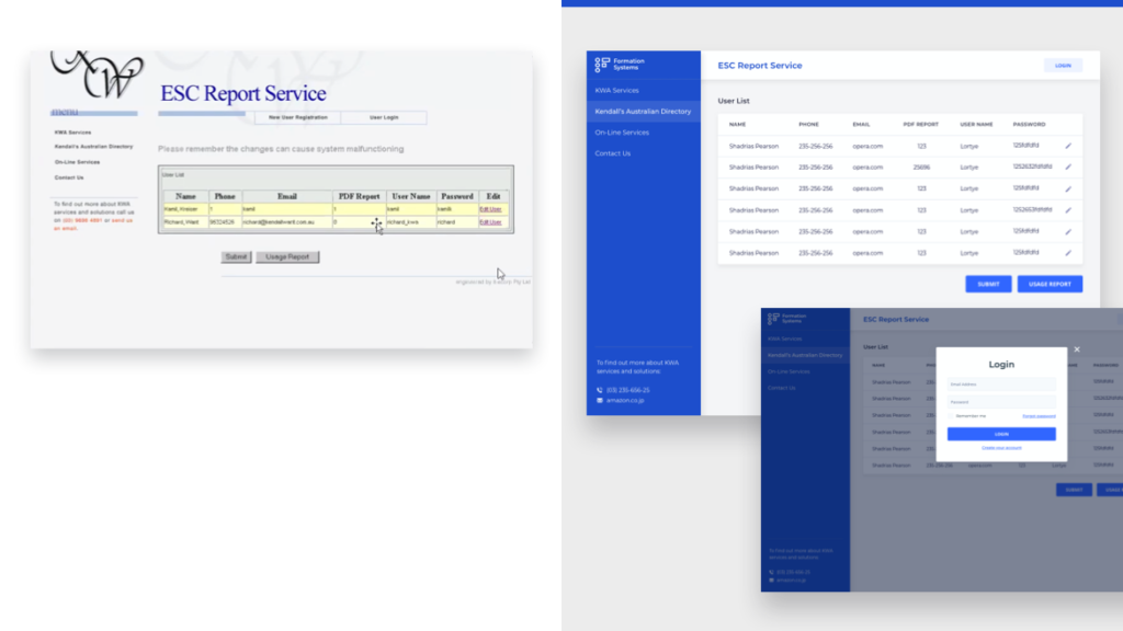
Interface is a mediator between a product and a person. In order to create an effective website for your business, you’ll have to think really hard about how to align the page elements relative to each other and relative to the shape, consider colour combination (carry out visual research, collect moodboards with the designs you like, etc.), make the main blocks on the page more visually accessible, pay attention to the scale of fonts regarding the page, each other, and hierarchy of fonts.
If you want to know whether your website design is giving visitors the right impression, fill our contact form and let PieSoft design team conduct a catch-all analysis with all tips & tricks to help your business stand out and reach the customer.
Mistake 2. Business website is using poor graphics and illustrations
Since the Internet and the 12-megapixel camera phone came along, it’s easier than ever to get high resolution photos. If you’re not a photographer, stock sites are all you need. Many of them even offer free options.
Here is an example of poor vs good graphics.
Mistake 3. Business website is using too many stock photos
Ok, ok, you know firsthand what photo stocks are. And here we are coming up to a new problem: overdose on falsity. We all saw those images of happy call center workers, models smiling and looking perfect in their office suits, etc. Little by little, this unrealistic picture is making your pretty real products fake too.
Invest in your own photos and convey genuine images.

Mistake 4. Your site doesn’t reflect your brand’s personality
Is your website good for your SEO and local search results? Great! But it is even more important to make it reflect your brand unique personality. This will help you differentiate your business from the competitors, attract the right customers and affect profits.
Make sure that you’re using the latest trends in web design in order to give more voice to your brend so that it could resonate with your audience’s personality.

Mistake 5. Website doesn’t reflect your current brand version
The website should always reflect the best and most up-to-date version of your company’s brand. If you’ve updated your logo, changed the corporate colors or anything like that, your website should be changed as well.
Just imagine that a prospect discovers your business, goes to your website, and then after a couple of actions, you send them a сommercial offer, brochure, or any other material that looks different. Most likely, the addressee might question if it’s the same company, and step down.
Make sure the branding on your website and all related materials are on the same page.
Mistake 6. Lacking of clear call to action
How to start a website business and make lead to results: attract users and generate sales? To help you with this, visitors need to know what to do next.
A clear call to action gives them the clue about their further step. Maybe they should sign up for a newsletter, attend an event, ask for a consultation, or order online.
Take a moment now to use the toolbar and experiment with the color, font, and size of your text, rearranging some elements (like placing an online consultant near the CFA button to hit possible objections).
Make sure your call to action grabs the visitor’s attention. Create a simple, engaging offer that demonstrates clear value. Or let PieSoft ingenious designers address the issue. And we’re moving on.

Mistake 7. Website is not mobile friendly (non-responsive)
According to statistics, 5.135 billion people are using mobile devices. That’s 4% more than a year ago, and this number is growing. Making your website responsive, you target more than half of the audience.
Wanna check if your website is mobile-friendly or wanna know how to make a website mobile friendly? Here and here are a couple of Google services to help you check the responsiveness of the site online.
Make sure you’ve built a business website with convenient access to your content both for desktop and smartphones, tablets and other gadgets.
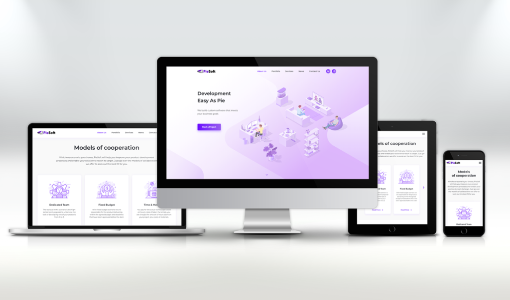
For instance, here is PieSoft website desktop and mobile versions. Easy to use, any way you look at it.
Mistake 8. Taking a long time to load
It all depends on the first impression. Users are impatient, so such metrics as conversion and bounce rates depend on site loading speed.
How fast should the pages load?
Simple answer: as quickly as possible. According to Kissmetrics, even a 1-second delay can cut conversions by 7%. Take a look at their infographic and you can see that up to 25% of users left the page with a load time of four seconds.
Is your website quick enough? You can check your download speed using Google PageSpeed insights.
Mistake 9. Difficult to navigate
Imagine that you are driving in a crowded city with unfamiliar road signs or no road signs and stoplights at all. Chaos. This is how your website looks like with unclear navigation.
What turns a website into a virtual traffic jam?
First, the hidden navigation bar. As you drive down the road, you know where to look to see a sign or traffic light. Your visitors also expect your navigation bar to be either at the top of your website or on the left sidebar. Don’t make them look elsewhere for it.
Incomprehensible tags also make users’ life more complicated. For example, Discover navigation link can provide many meanings, such as company information, new product suggestions, or a blog. Also there may be too many product subcategories on Ecommerce websites. Sometimes it can be especially confusing.
Finally, don’t make your website visitors fail looking for some basic information about your company. All these pages like About Us, Products or Services, and Contact Page may sound boring, but when it comes to navigation, stick to standards.
A good navigation is not about reinventing the wheel.
Mistake 10. Still using Flash elements
Hey, it’s been almost a month since 2021 has happened to you. This means that Adobe has already stopped updating and supporting Adobe Flash Player. Due to weak security and poor performance, Flash is no longer supported on most mobile devices, and it has been phased out by many browsers. No need to be sad about technology that has sunk into oblivion. Here is a Flash Checker Tool. You know what to do.
Hope we’ve helped you figure out whether your site is up-to-date according to the latest trends in web design. If there’re any other questions that you have or you need assistance to make your website great again or design it from scratch, don’t hesitate to contact us.