
Cirrus survey UX/UI redesign
Cirrus is a web application for health insurance companies running their businesses in the US. Users experienced trouble using the survey creation form. We were assigned to conduct a UX/UI redesign of the interface to improve the interaction experience and reduce pain points.
Survey Creation Process
Creating a survey is based on asking questions and providing options for answers. The main task was to make it understandable. To meet this goal during the UX/UI redesign process, we placed all the questions and answer options in nested blocks to make it easily interactable for the users.
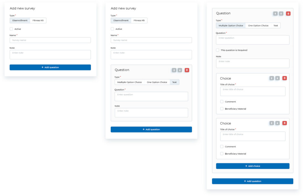
Survey Creation Form
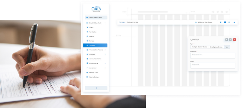
The main reason to conduct a Cirrus survey UX/UI redesign is that it is very bulky and divided into three columns. In our new version, we used a single-column design that significantly reduces the visual noise by reducing the number of objects on the screen.
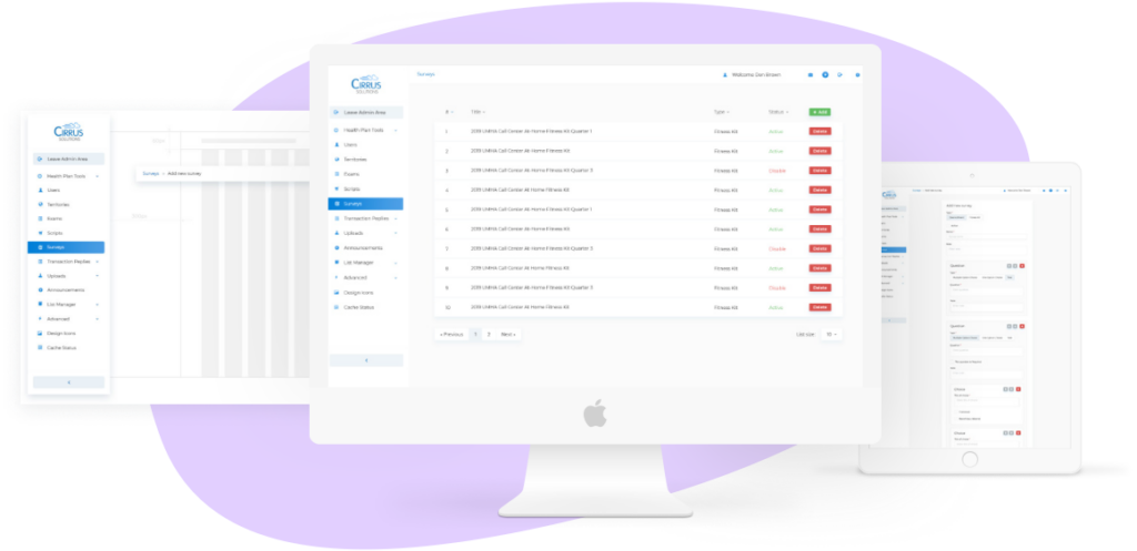
RESULTS
As a result, we got a clean, light, and convenient interface that adapted to be user-friendly for use on all existing mobile devices.
DO YOU HAVE A SIMILAR PROJECT IDEA?
No matter how complex your IT project goals are, our professional business analysts will increase the product quality while reducing its costs.
OUR HEADQUARTERS
We are open to new challenging tasks and we'd love to learn more about your project.